For my final project in the UX Writing Fundamentals Course at UX Content Collective, I completed a UX/UI revamp for the fictional app Handshake, a collaborative payments and project product for business owners and freelancers.
Task:
Provide all UI text within the confines of the current design ahead of a major design presentation and review.
Propose UX improvements in the app.
Create and adhere to style guide.
Use provided research and user personas.
No collaboration or ongoing research is available.
My role:
UX writer
Tools used:
Figma
Google Docs
Results:
Grade: A
Positive instructor feedback
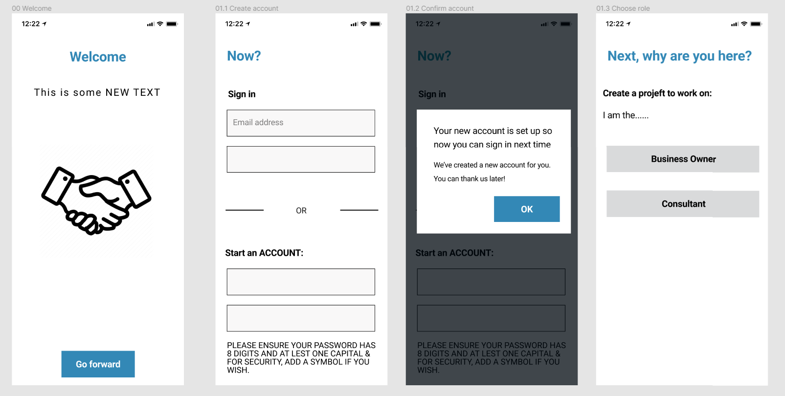
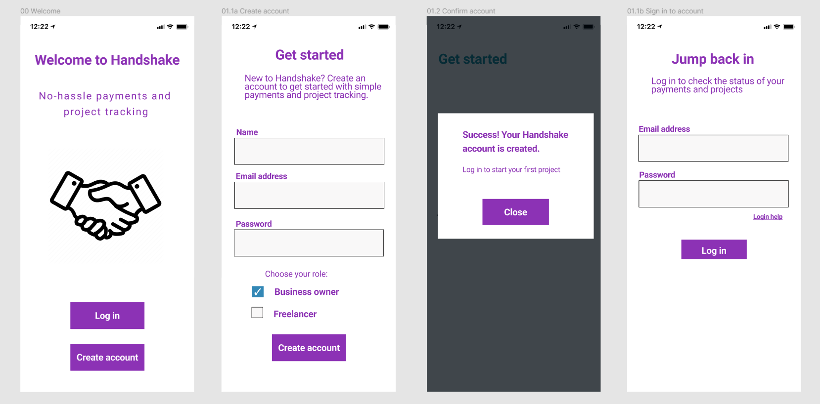
Sign up flow
App sign up flow - Before
App sign up flow - After
Problems observed:
“Go forward” button text is unclear and unhelpful.
Combining new and returning users’ experiences on one page is a cognitive burden.
Success dialog box is too verbose, has poor tone, and was not written in a user-first perspective.
Role selection on an isolated screen adds an unnecessary step.
Lack of text field labels may confuse users when typing.
My solutions:
Added “Log in” and “Create account” buttons for returning and new users, respectively.
Added Handshake’s name and tagline to support branding and provide familiarity for users.
Separated screens for new and returning users to prioritize relevant info.
Added checkbox for role selection to eliminate an unnecessary screen.
Replaced success dialog box text with a more concise version using improved tone.
Continuing research questions:
Do users prefer a checkbox or a radio button to choose their role?
Do users prefer a button or an X to close the success dialog box?
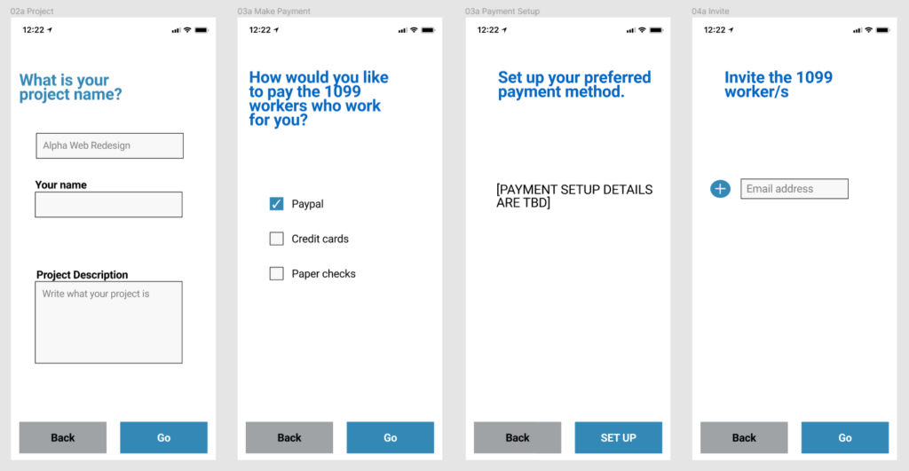
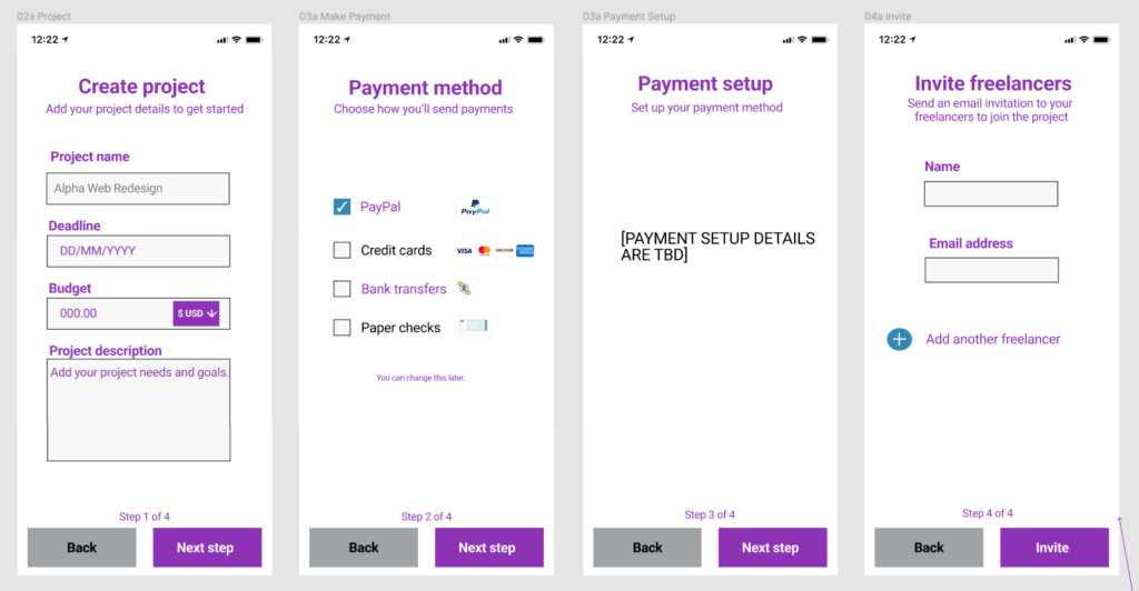
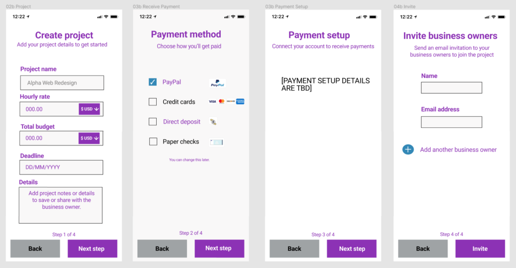
Create project flow (for business owners)
Business owner create project flow - Before
Business owner create project flow - After
Problems observed:
Unlabeled text fields may confused users when typing and hint text disappears.
“Your name” is an unnecessary text field when users already provided that at account setup.
“Go” button text may give the idea that there are no additional steps to follow.
Text is inconsistent with style guide, grammatically incorrect, and verbose.
My solutions:
Replaced the unclear “Go” with a clearer “Next step” button.
Added a step indicator label at the bottom to make setup clearer.
Added currency selector for international users.
Added bank transfer as payment method.
Added payment option symbols to enhance visual.
Continuing research questions:
Do users prefer the invitation screens to be part of the project creation flow, or in project management?
How do users feel about the term “bank transfers”? Do they prefer “direct deposit” instead?
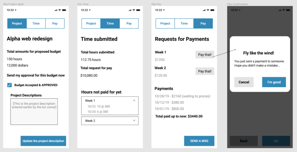
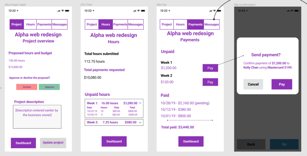
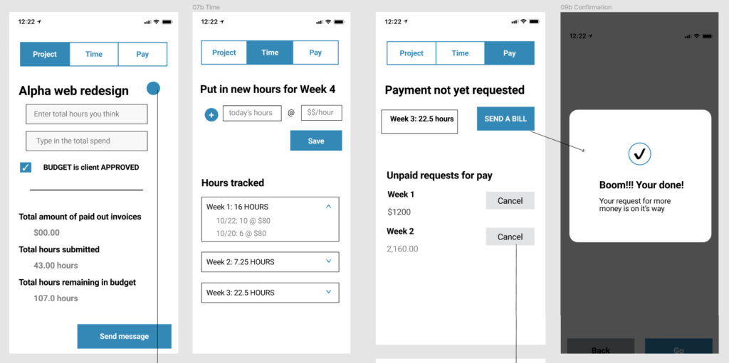
Manage project flow (for business owners)
Business owner manage project flow - Before
Business owner manage project flow - Before
Problems observed:
Headings are inconsistent.
Payment dialog box is unclear and its tone is condescending — completely inappropriate for the app’s voice.
Currency format is inconsistent and does not align with style guide in all cases.
Button text is too long and inconsistent with style guide.
User has no way to access a main account portal where they would select a project.
Project name is only on one screen in the flow, which may confuse users with multiple projects.
My solutions:
Added Messages to navigation bar. In this collaborative environment between users, messaging is important.
Added buttons for business owner to decline or approval the proposed budget.
Improved layout of hours and payments.
Added key info to payment confirmation screen to reassure users.
Added dashboard buttons so users have a way to navigate to a main account portal.
Added project name to screen headings.
Continuing research questions:
When declining proposals, do users want an additional screen to send a message or a counterproposal?
Do users want an option to edit project hours and budget? If so, should such an option require mutual approval?
Where should a “change payment method” option be included?
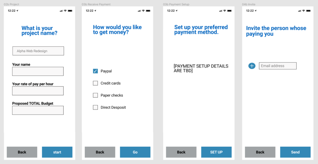
Create project flow (for freelancers)
Freelancer create project flow - Before
Freelancer create project flow - After
Problems observed:
“Your name” is unnecessary when users already provided that at setup.
Label text is too long and inconsistent.
Input fields lacking hint text may confuse users.
Input fields aren’t collecting enough important info such as project details and deadline.
My solutions:
Added label text and hint text to input fields.
Added currency selector for international users.
Added fields for deadline and details, which is key info for project collaboration.
Added “direct deposit” as a payment method.
Added payment icons to enhance visuals.
Improved headings and subheadings.
Continuing research questions:
Do users prefer the invitation screen to be part of the project creation flow, or in project management flow?
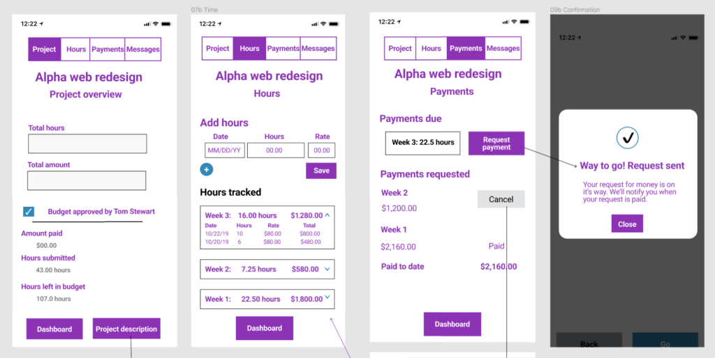
Manage project flow (for freelancers)
Freelancer manage project flow - Before
Freelancer manage project flow - After
Problems observed:
Missing labels for text fields.
Language is inconsistent from style guide.
Text is too long.
Project name is only on one screen, which may be confusing to users with multiple projects.
Hours tracked begins with oldest first, requiring more scrolling to access the newest entries.
Users have no option to choose a date when entering hours, which can create problems if they forget to submit hours in a corresponding week.
Dialog box has no obvious way to close.
My solutions:
Added project name to screen headings.
Reordered tracked hours so the most recent entries appear on top.
Added a date field for users to add hours in case entries are not submitted in a corresponding week.
Improved format of hours tracked so the total amount owed is calculated with each entry.
Continuing research questions:
Do users want an option to edit hours submitted? If so, should this action be performed via an edit button, a press-and-hold option, or another option?
Do users prefer a close button or an X to dismiss the dialog box?
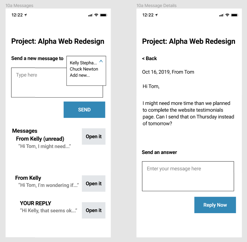
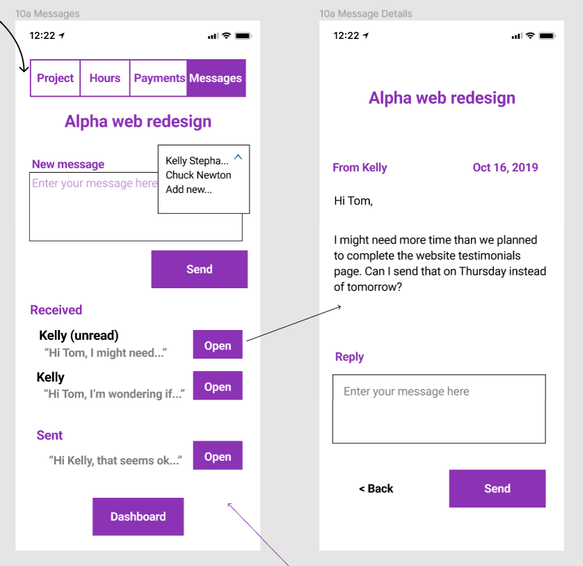
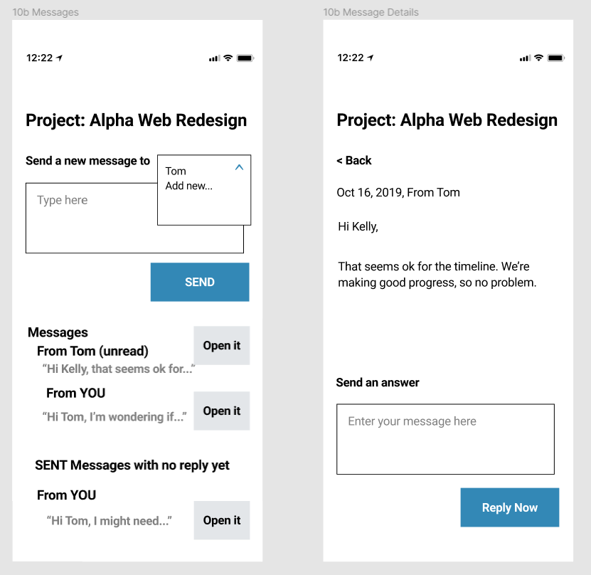
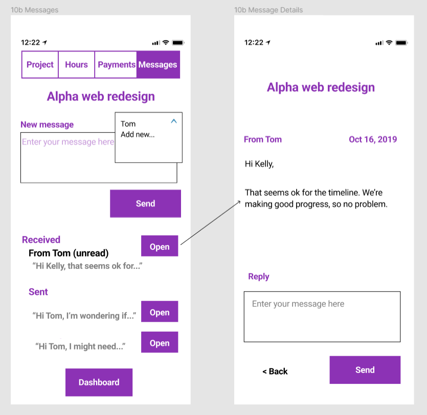
Messaging flow
Business owner messaging flow - Before
Business owner messaging flow - After
Freelancer messaging flow - Before
Freelancer messaging flow - After
Problems observed:
Users have no way to navigate to previous screens from the inbox screen.
Text is too long.
Text is inconsistent with style guide.
My solutions:
Added dashboard and back buttons to improve user navigation.
Added a navigation bar at the top for users to switch between project screens.
Improved message headlines.
Condensed text.
Continuing research questions:
How do users prefer to see confirmation of a message sent? Should a dialog box appear to confirm, or another option?
Should read/unread messages be distinguished with labels or bold/regular text?
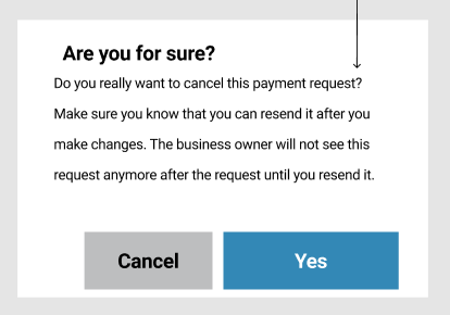
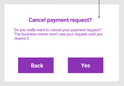
Cancelation dialog (for freelancers)
Problems observed:
Text is too long, grammatically incorrect, and confusing.
“Cancel” button may confuse users trying to cancel an action.
My solutions:
Created “Back” and “Yes” buttons to make it clear users can return to the previous screen or affirm their intent to cancel.
Shortened the text to reduce cognitive load.
Continuing research questions:
Do users prefer colored buttons here?
How do users feel about this heading versus alternatives?
Should the first sentence be eliminated?
Final thoughts
Completing the project on my own with limited research and without collaboration or continued project involvement required me to expand my thinking to anticipate user pain points, identify and resolve gaps and friction, and spell out areas requiring deeper consideration.
A real team moving forward with this product should conduct live user research sessions showing users the original and revised mockups to gauge reaction and collect feedback. These results will help determine if revisions have been effective in resolving pain points, and help us identify areas on which to focus more revision and testing.